Project Butters, an indie jump-hour from Red 5 Watchworks, redefines wearability and legibility. This mechanical timepiece is designed for people, not safes, prioritizing comfort and clear time-telling above all else.
By Nick
July 1, 2026 5 min read 0 views
Jump-hour watches have an inherent problem. They often swing between two extremes: fascinating but impossible to read, or legible but utterly devoid of soul. It's a tough balance. But every so often, a project emerges from the indie scene that makes you sit up and pay attention. This time, it’s coming from Red 5 Watchworks.
It’s called Project Butters, and it’s a mechanical jump-hour built around a simple, powerful idea. The creator said it best: this was “designed to be the jump-hour watch I would have wanted.” The guiding principles were just as direct: readability and comfort.
This isn’t about chasing trends or creating another hype piece. It’s about solving a design problem with obsessive attention to detail. Let’s get the core numbers on the table so you can see what I mean.
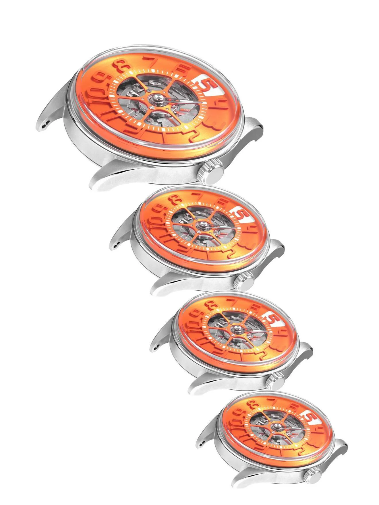
The story of Project Butters begins with its case. At 41mm in diameter with a 48.2mm lug-to-lug, the dimensions are refreshingly moderate. This isn't a dinner plate designed for Instagram wrist-rolls; it’s sized for actual, daily wear.
Red 5 has explicitly stated the watch is designed for wrists from 5.5 inches all the way up to 8.5 inches. That’s an unusually specific and broad target. It tells you that wearability wasn't an afterthought—it was a foundational pillar of the entire project.
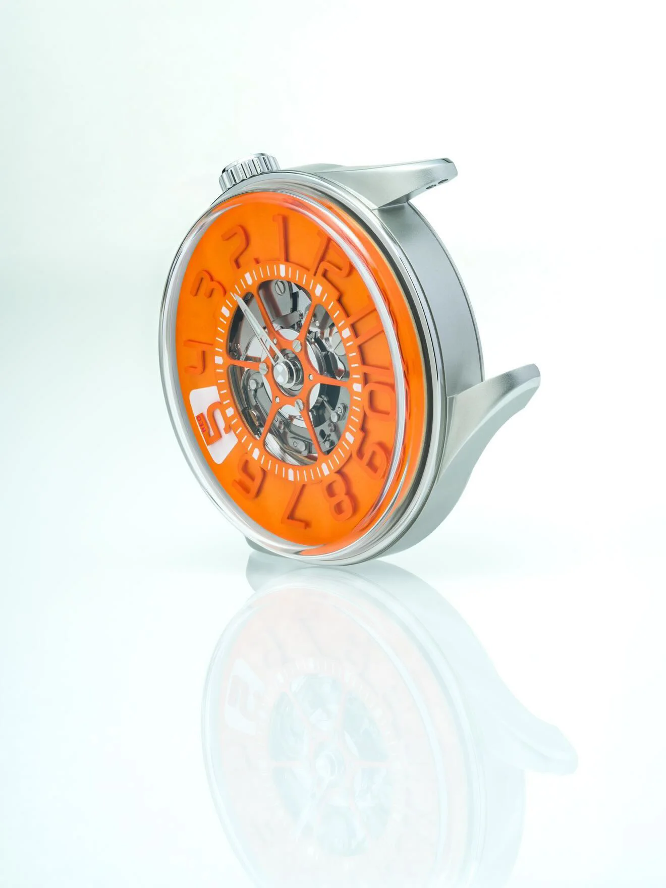
The real magic is in the height. The mid-case is a slender 6.7mm thick, which should allow it to sit low and comfortably on the wrist. All the visual drama is pushed vertically into the crystal and dial, a smart move that keeps the watch from feeling top-heavy or clumsy.
Straps, Sorted
Here’s a detail that shows an enthusiast was at the helm. The 20mm lugs feature two sets of drilled lug holes. This is a small thing that makes a huge difference.
One set is for standard straight-end straps, giving you that classic look with a slight gap. The other is positioned for curved-end straps, allowing for a flush, integrated fit against the case. It’s a thoughtful touch that gives the owner total control over the watch’s profile.
Dual lug holes might seem like a minor spec, but for anyone who obsesses over straps, this is a game-changer. It shows a deep understanding of how a watch actually wears and lives with its owner.
Finally, A Legible Jump-Hour
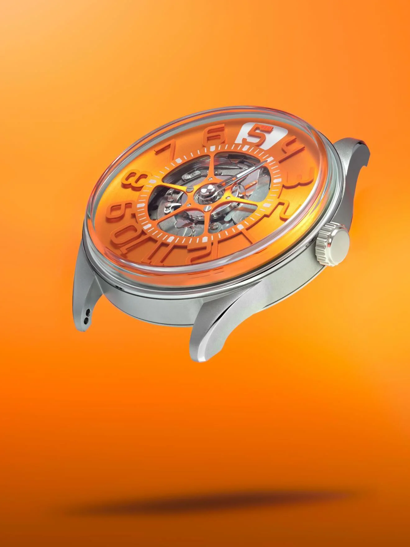
The second guiding principle was readability, and Red 5 tackled this head-on. Many jump-hours hide tiny numerals in convoluted apertures. Project Butters throws that playbook out the window.
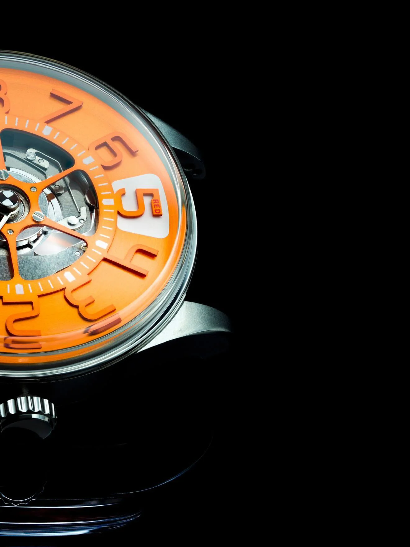
The hour indexes are a massive 4.85mm tall. This ensures that the primary function—telling the hour at a glance—is never compromised. It’s a choice that prioritizes function over fussy artistic expression.
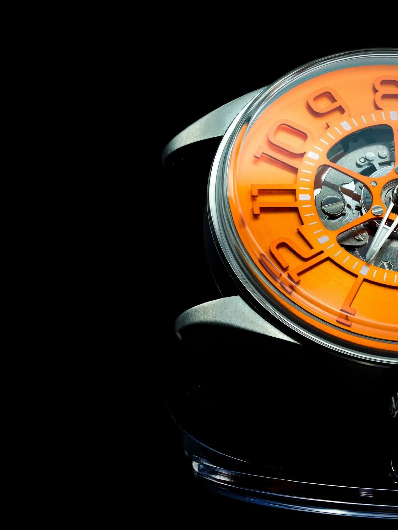
This is made possible by the "tall dial" architecture. The entire display is given more vertical space to work with, preventing the cramped feeling that plagues so many complicated watches. It’s a deliberate counter-argument to the mystery-dial trend, a jump-hour that wants to be read.
While the case sits low, the crystal does not. It rises a full 4.8mm above the bezel, creating a dramatic, architectural profile. This isn’t just for looks; it provides the necessary clearance for the tall dial and the complex mechanics of the jump-hour module underneath.
This combination of a slim mid-case and a tall crystal is the watch’s core visual signature. It splits the difference between dressy and toolish, creating something unique that should have a ton of presence without sacrificing comfort. The finishing, based on early prototypes, appears to be a mix of brushed and polished surfaces, but we're waiting on the final word.
The Details We're Waiting For
Of course, this is a pre-release look. Red 5 is building anticipation by revealing details in stages, a classic move for a community-focused micro-brand. We know it’s a mechanical jump-hour, but the specific caliber—whether it’s automatic or manual, the base movement, and the power reserve—remains a secret for now.
Pricing, reference numbers, and the final list of dial colors are also still under wraps. This is part of the fun of following an indie brand from the ground up. You get to watch the final product come into focus piece by piece.
Case Diameter
41mm
Lug-to-Lug
48.2mm
Case Height (Mid-Case)
6.7mm
Crystal Height
4.8mm
Total Height (Approx.)
~11.5mm
Lug Width
20mm
Hour Numerals
4.85mm
Case Back
Solid, for engraving
A Personal Touch
Instead of a sapphire exhibition caseback, Red 5 made a very intentional choice: a solid steel back. Why? It's left as a blank canvas, designed specifically for personalized engravings.
This reinforces the idea that Project Butters is meant to be a "keeper." It’s not just a product; it’s a personal object intended to carry meaning, whether that’s a date, a name, or a message. It shifts the focus from showing off a movement to creating a connection with the owner.
The brand's main hub of activity is its Instagram page, where these details are slowly being shared with a growing community of enthusiasts. It's an open conversation, and the transparency about dimensions and design intent is building a ton of goodwill long before the watch is even available.
Project Butters is exactly what the indie scene needs more of: a watch with a clear, uncompromising vision. It's a thoughtful answer to the flaws of its complication, built for wearability first. For anyone who loves clever engineering and legible design over brand hype, this is a project to follow very, very closely.
Join the Waitlist
For now, Project Butters exists in tantalizing prototypes and spec sheets. Red 5 Watchworks is directing anyone interested to their new website to sign up for the mailing list. That will be the best way to get first-dibs on launch information, pricing, and availability.
Following the journey on Instagram is also essential. It’s where the community is being built and where the final details will likely drop first. This is grassroots watchmaking at its best, and we can’t wait to see the final product.
GALLERY
WRITTEN BY
Nick
I originally started VELOCE to put my skills to work, hone my app design and web development practices, and dive deeper into the world of horology. I wanted to learn more about the watches, the brands, and the incredible people behind them - the creators, the designers, and the collectors. I love discovering new timepieces and sharing their stories with the world. VELOCE is my ultimate passion project and hobby, the creative space I head to after my full-time job to build something I truly care about.

 By Nick